Overview
This management system is a cloud-based platform that supports internal and external B2B clients to manage entire cargo operations for ALP, Asia's smart warehouse leader.
I led end -to-end process, from research to design, to redesign the entire management system, including an app and a dashboard.
Duration
2023-2024
3 Phases
My Role
Project Lead
UX Designer
Responsibility
Product Strategy
Stakeholder Buy-In
User Research
UX Design
Design Framework
Usability Testing
Direct Stakeholders
CEO
SVP of Information Technologies
Visual Design Director
Problem Context
In any warehouse, speed is everything.
However, staff struggled with scattered app data and poor dashboard visibility, due to the legacy system's design.
60% Responses Delayed
Of emergency responses delayed due to system inefficiencies
Overwhelming Complaints
B2B clients reported significant delays in operational response times
6-Year-Old Design
Of uncoordinated system growth without redesign, misaligned with current needs
8 Stakeholder Groups
Diverse operational needs drove continuous feature additions, leading to system complexity
Core Challenge
How might we prioritizes efficiency while supporting multiple stakeholders' data needs during system redesign?
Solution Highlight
An optimized data platform prioritizing efficiency, visibility, and simplicity to deliver a seamless operational experience

Impact
"The redesigned system dramatically improved coordination and efficiency for our staff"

Claire Hung
Product Manager, ALP
4.9/5 Satisfaction
This project received high customer satisfaction score from our client
Global Deployment
Successfully deployed to 11 facilities in Taiwan, Malaysia, and Thailand
Proven reliability
My design has undergone 200K+ daily operations stress test
Research Activity
I organized on-site observations and stakeholder interviews to understand operational pain points.

Key Challenges
From the research data, I identified 3 key challenges contributing to the struggles warehouse staffs suffered.

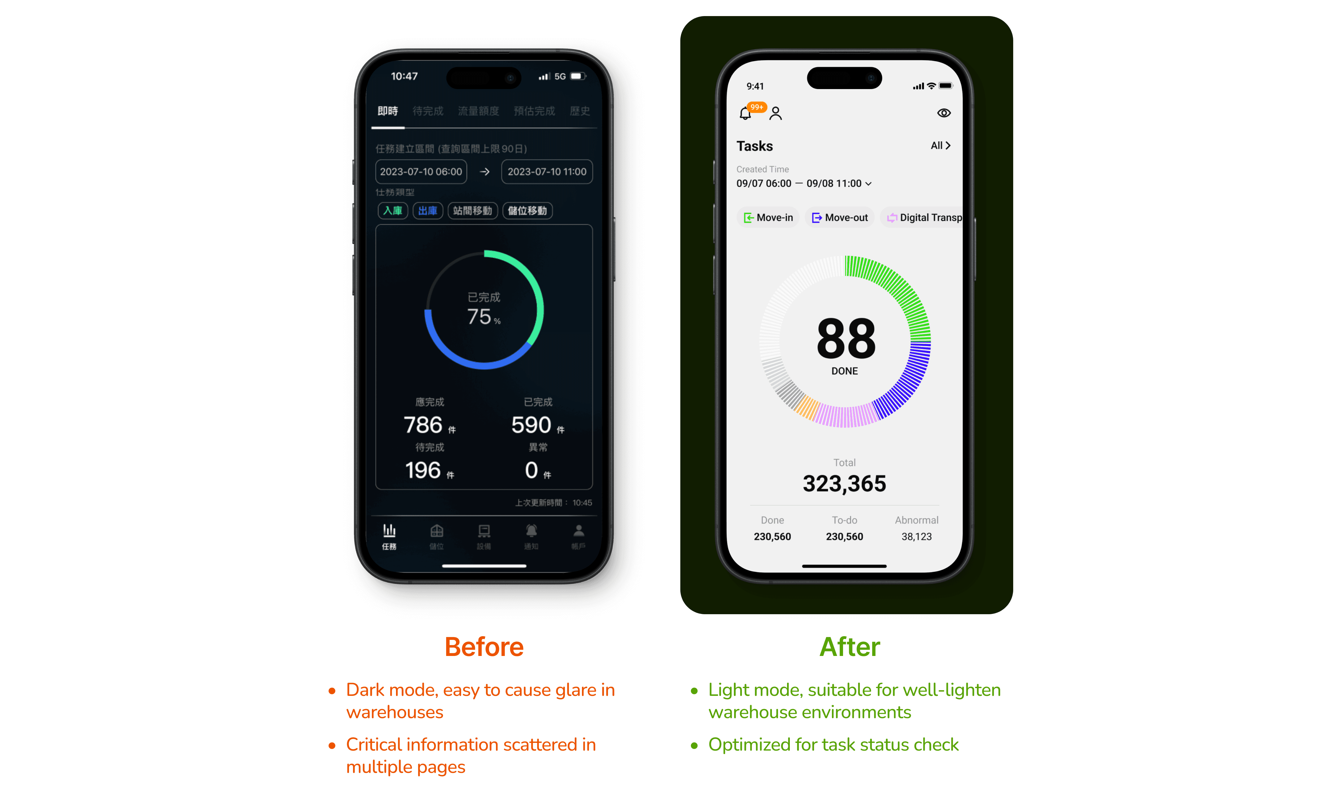
Scattered app critical data
Delays warehouse status check and maintenance response.

Small app text causing error
Staff struggling with attention, causing high error risk.

Dashboards unreadable from distance and in bright light
Forcing staff to approach the screen for status checks and easily causing glare and impacts staff's readability.
Stakeholder Needs
I also grouped 8 stakeholders into 3 categories based on their data needs

Synthesis I
I defined project strategy: Tackle app structure first
I prioritized mobile redesign as the starting point, given its portability and broader impact across teams. This allowed us to test and validate core information structures where users needed them most - right in their hands during daily operations.
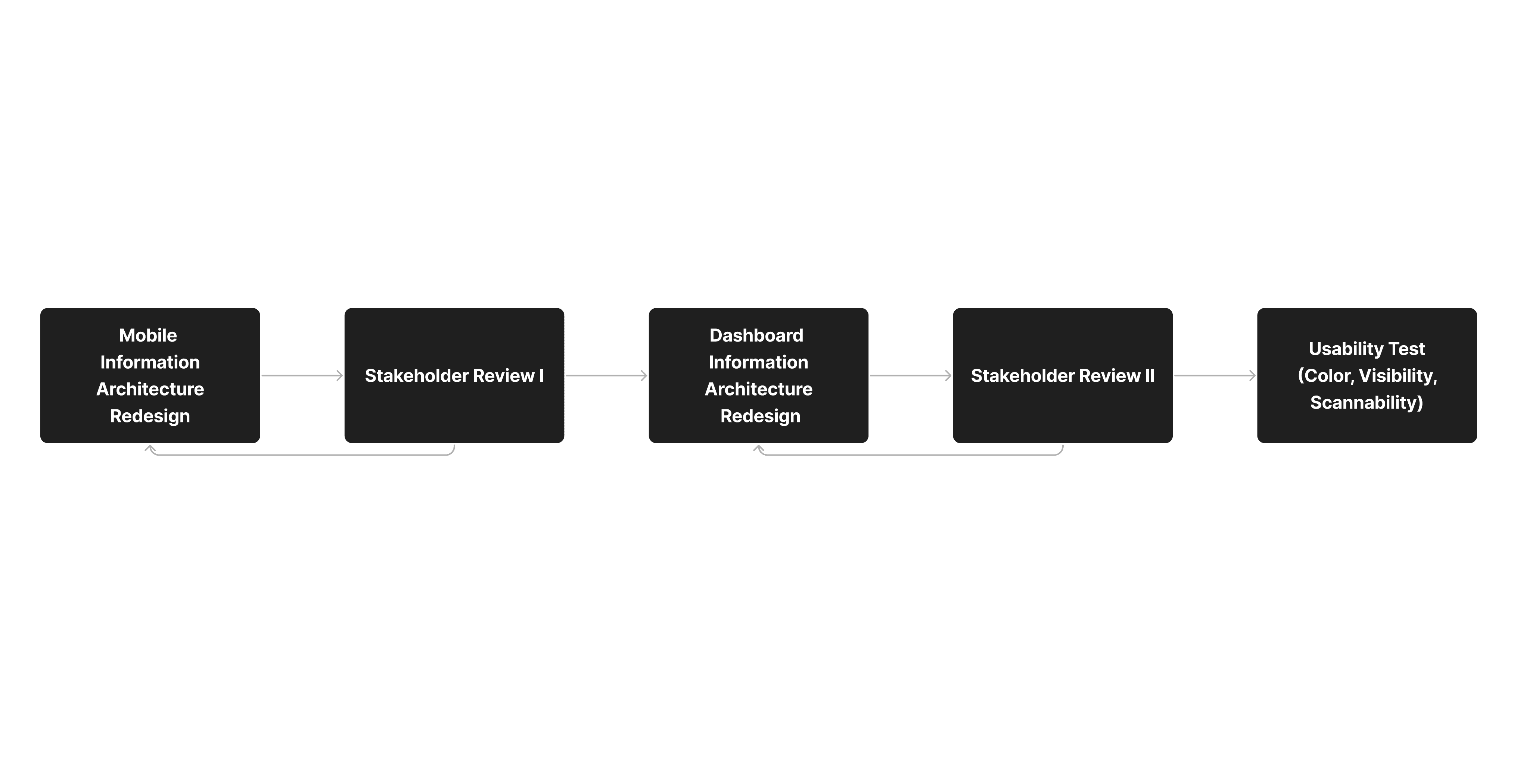
Synthesis II
I mapped 3 stakeholder groups' information needs to identify common key data
I analyzed how each stakeholder category interacts with data, mapping out their specific needs and common data requirements to inform the dashboard design

Synthesis III
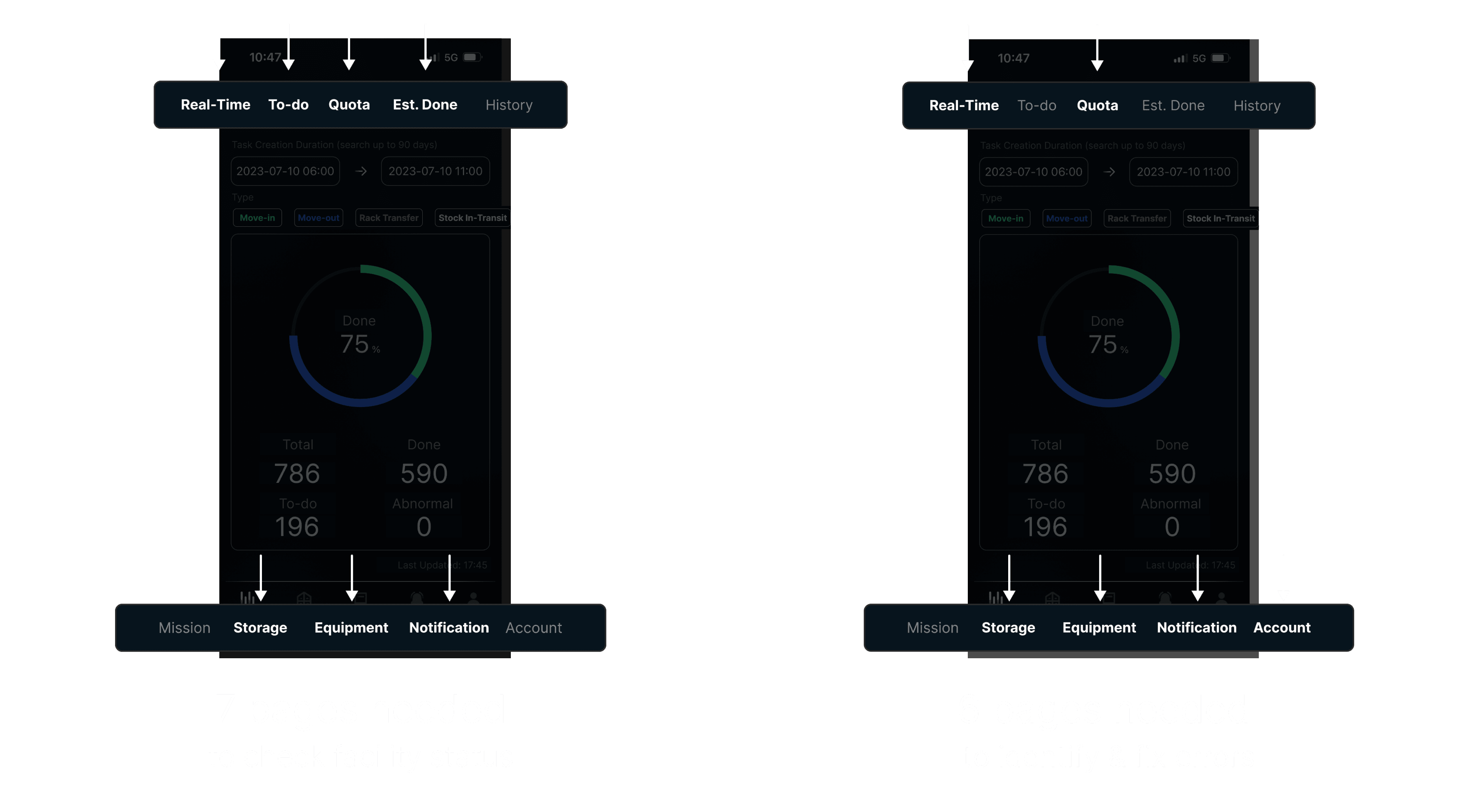
Result: I reorganized app information architecture — unifying and prioritizing critical functions in one page
I regrouped essential features - tasks, storage, and equipment status - into a unified dashboard view, while keeping secondary functions separate. This new structure provides quick access to critical operational data while maintaining a clean interface.

Solution Highlight
A data platform that optimizes warehouse efficiency by unified data, specialized font system, intuitive dashboard hierarchy, and adaptive display modes.

Challenge 1
Scattered app critical data slows staff efficiency
Solution 1
Centralized data for quick status checks and emergency responses
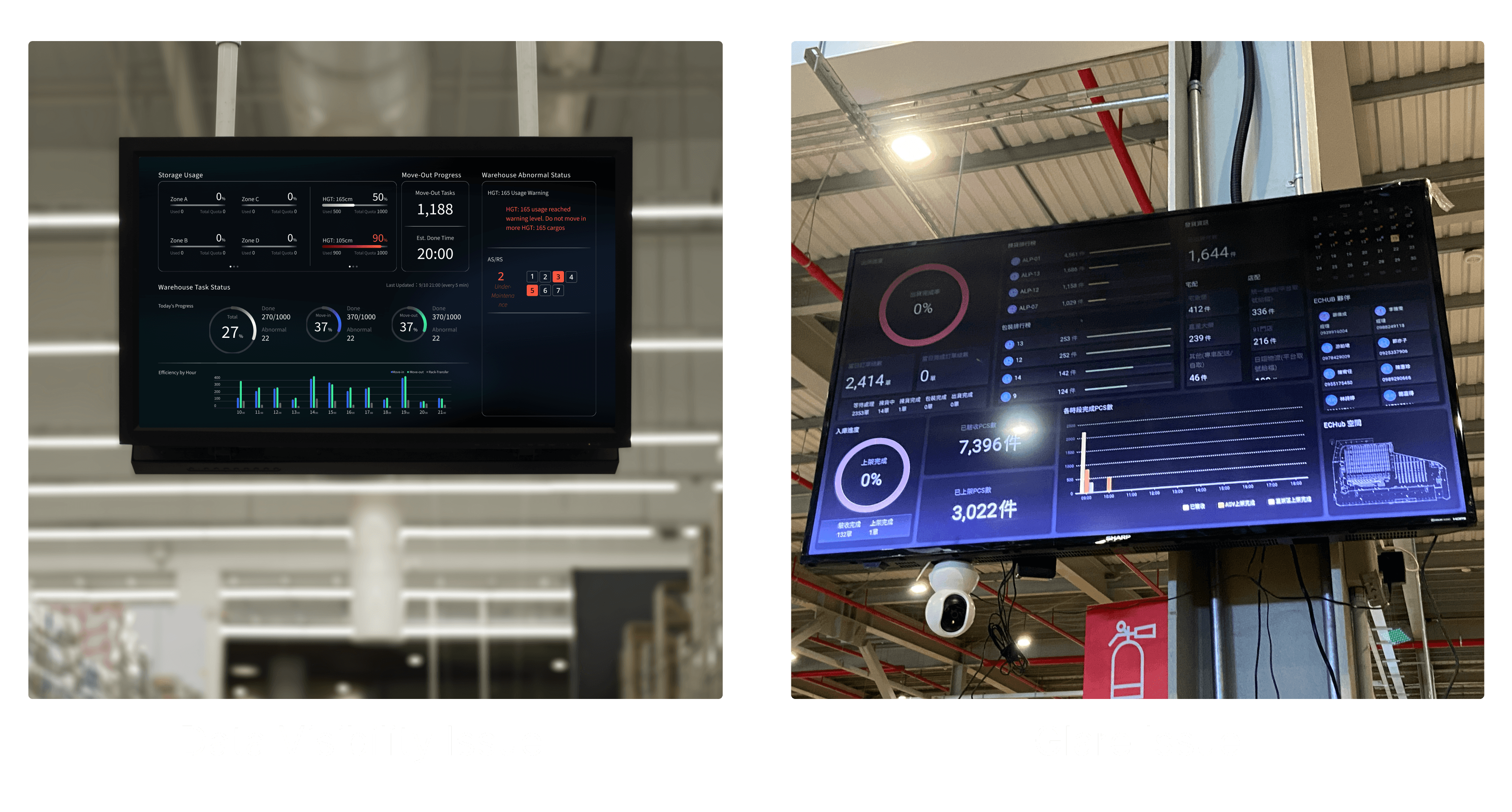
Unified warehouse status dashboard

“The redesigned system ensures perfect information sync across all warehouse key users”
Claire Hung
Product Manager, ALP
Challenge 2
Small app text causes mistakes during rushed work
Solution 2
At-a-glance design system
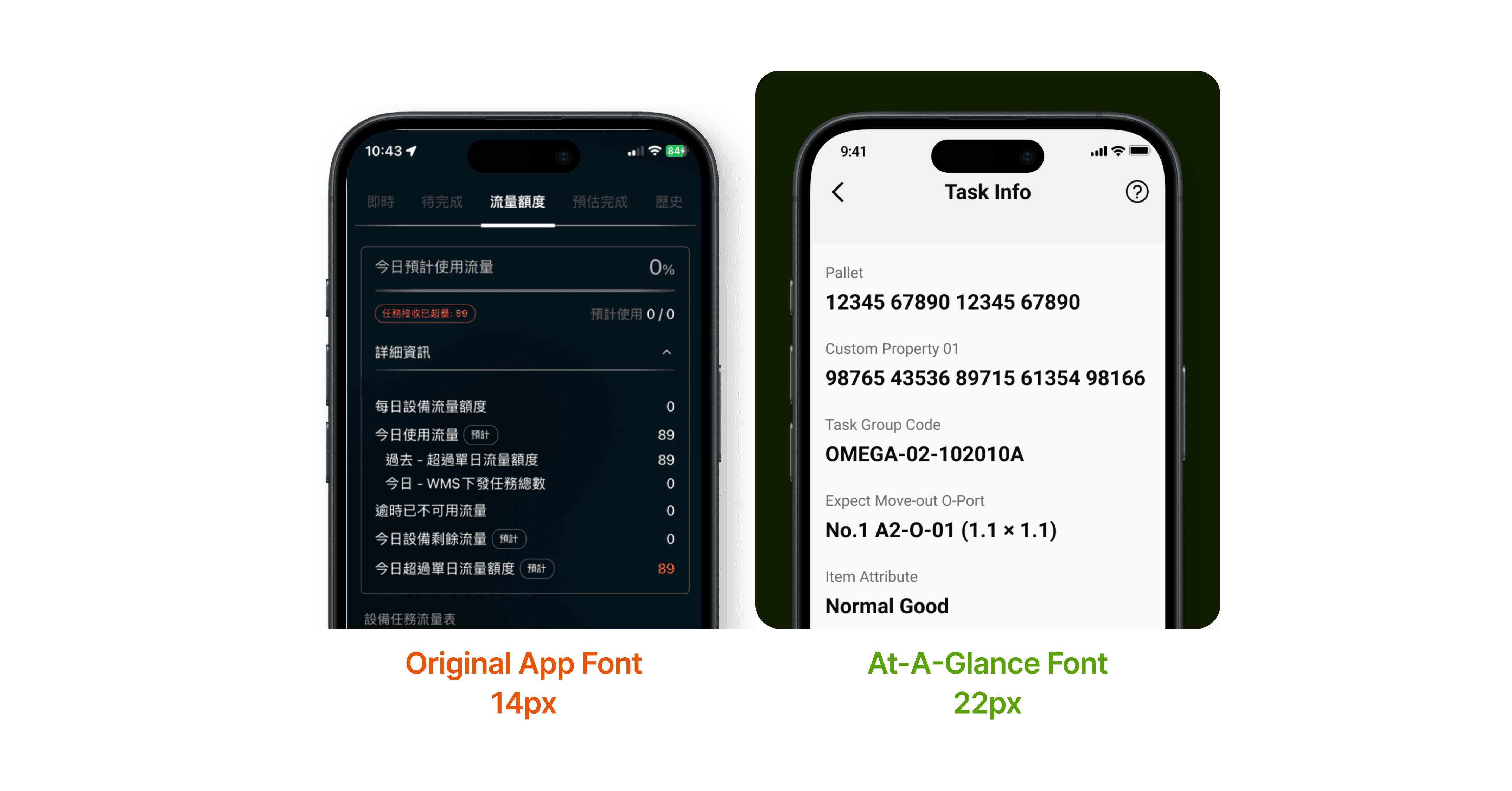
Larger, bolder
+36%
larger font size
Bold
font weight

“My team loves the new system. It's made their jobs much easier and more efficient”

Joe Yu
Warehouse Manager, ALP
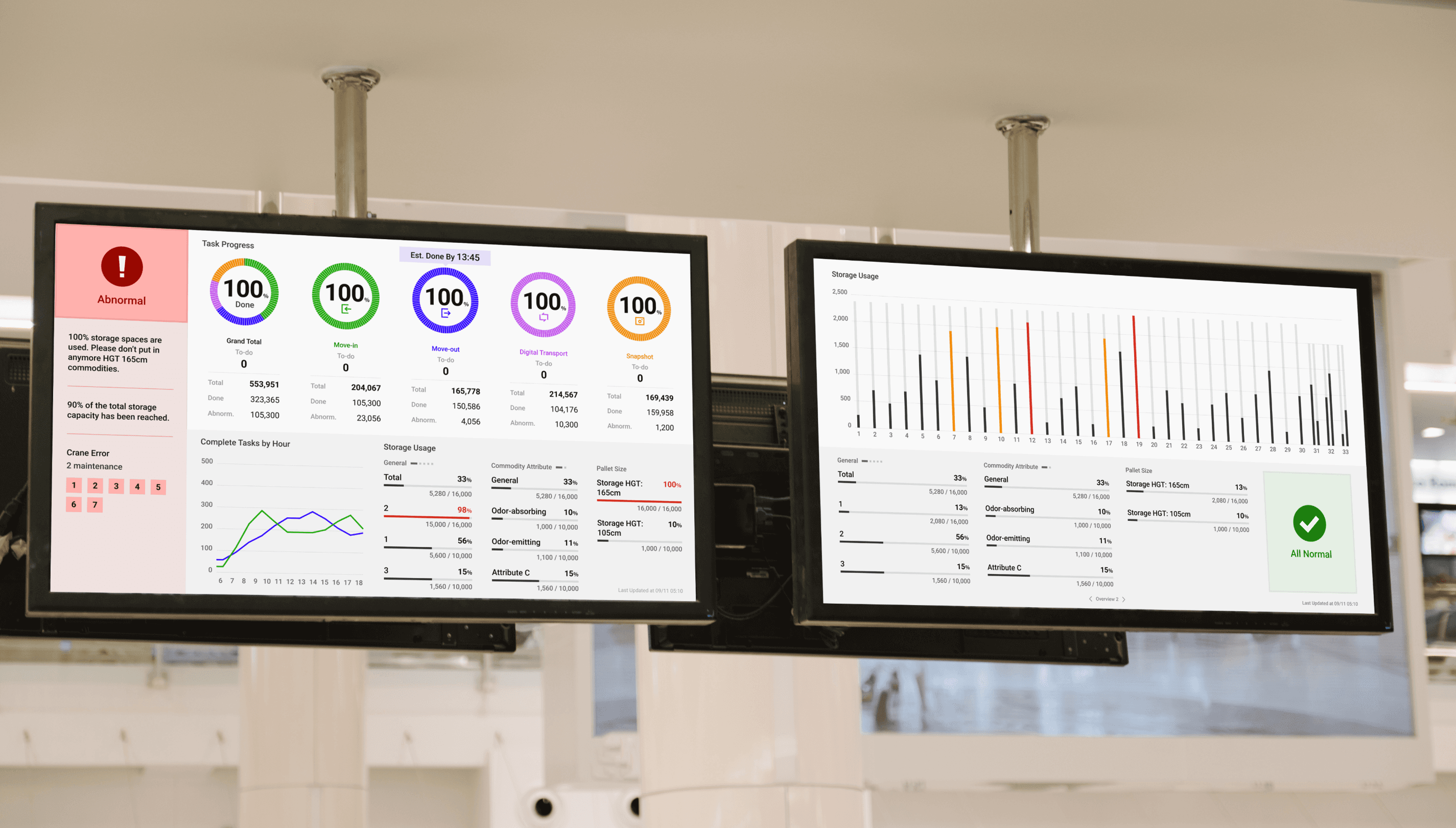
Challenge 3
Dashboards unreadable in bright light and from distance
Solution 3-1
Clear warehouse status & intuitive data hierarchy

Priority-driven layout

At-a-glance warehouse status

“Being able to check data from a distance has made our work so much smoother”
Joe Yu
Warehouse Manager, ALP
Solution 3-2
Adaptive displays, comfort for 24-hour shifts
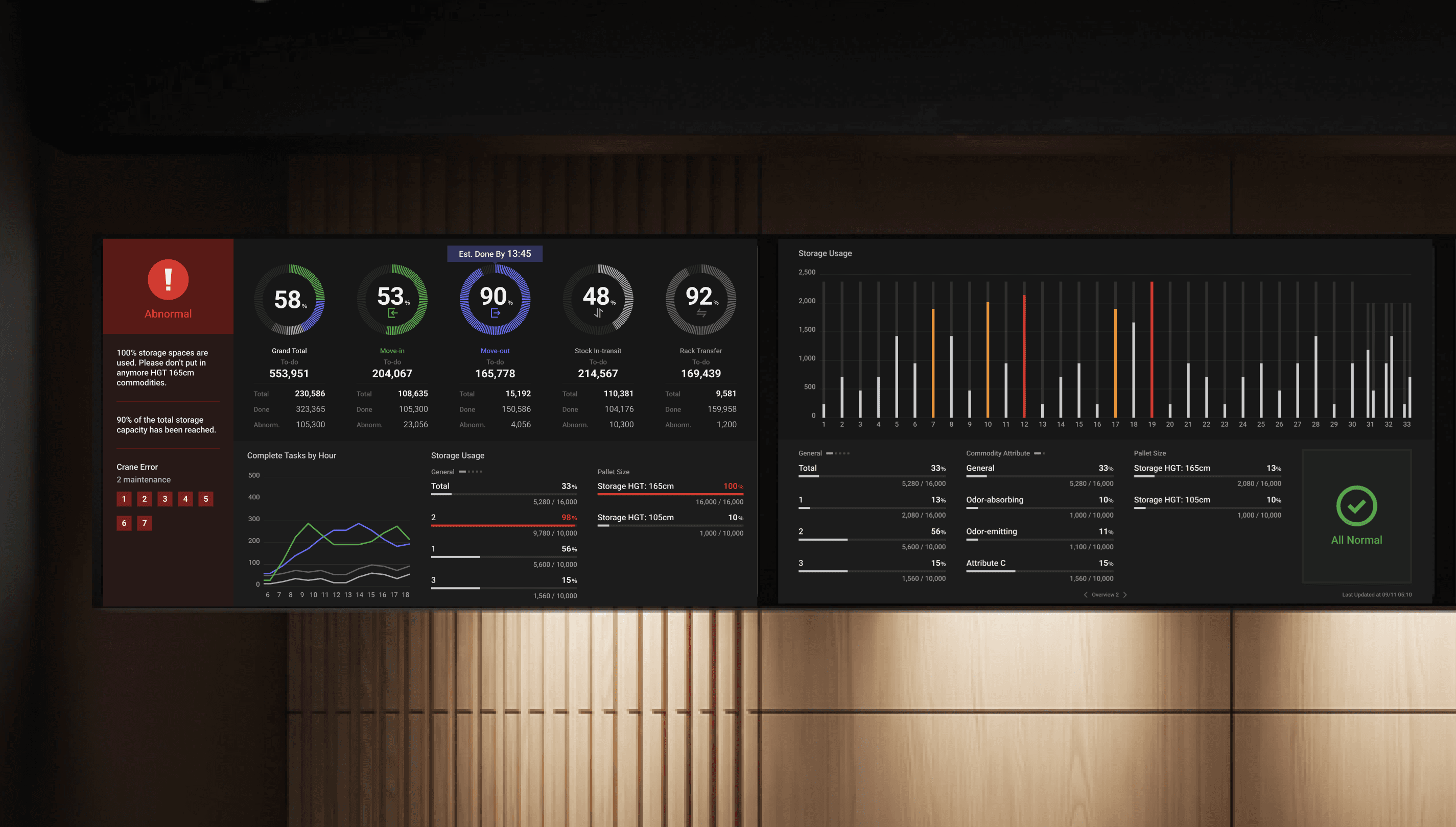
"The screens are so much easier to read now - we can adjust them to work perfectly in any lighting"

Anita Kuo
Warehouse Maintenance Staff, ALP
Reflection
Key learnings
Field insights are key to bridge physical experience
The most critical insights – like visual fatigue issues and status-checking anxiety – weren't apparent in initial requirements. Only through on-site observations and direct operator interviews did I uncover these essential pain points.
Strictly prioritizing information enables faster, confident decisions
Early iterations had too much information competing for attention, slowing operators down. Through usability testing, I learned that stripping away non-essential data and surfacing only the most critical insights drastically improved decision-making speed. By refining the hierarchy of information, I reduced cognitive overload and enabled operators to act with confidence—especially in high-stakes situations. This experience reinforced that clarity isn’t just about aesthetics; it directly impacts efficiency and performance in real-world workflows.
